
TNR Rebrand
TNR IS A PRESS ASSOCIATION COMPANY
INVOLVED IN THE CREATION OF MEDIA PROMOTIONS.


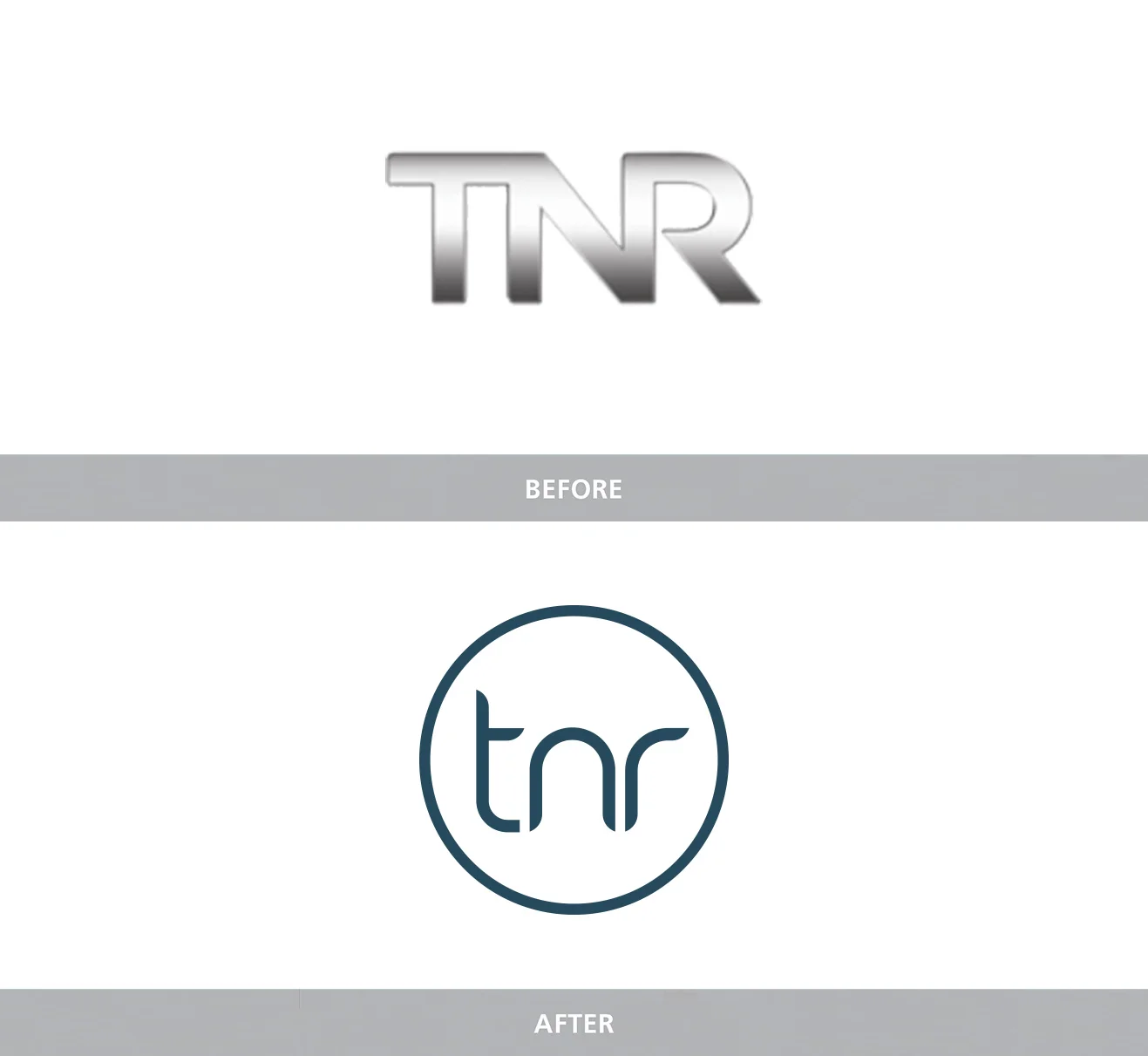
Their existing identity was considered to be too masculine and at odds with their brands direction. I introduced a new, cleaner logo with bespoke typography to present their company in a more modern and appropriate way
